
Case study · UX/UI audit
Echopod: an AI-assisted UX/UI audit that ends in a plan
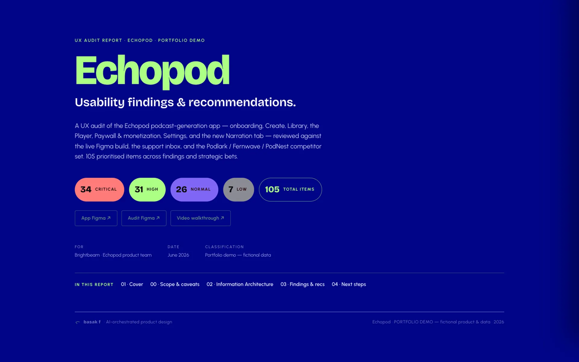
A full UX/UI audit of a mobile app that turns a short prompt into a podcast episode. 105 prioritised items, sorted by value and effort and sequenced into a sprint plan, delivered as one interactive file.
- Client
- Anonymised, shown as Echopod
- Our role
- UX/UI audit
- Type
- Mobile app, its website and App Store page
- Format
- Interactive HTML report and a video walkthrough
What is an AI-assisted UX/UI audit?
An AI-assisted UX/UI audit is a senior designer's review of a live product, where AI tools do the legwork of organising, cross-referencing and packaging the findings, and the designer makes every judgement. The result is a prioritised list of problems and recommendations, each tied to a screen, graded by severity and effort, and sequenced into what to fix first.
Echopod is how we show one. It is a real client audit, anonymised end to end: same structure, same method, invented names and numbers.
The problem
The app had a strong idea and a working product, but it had grown screen by screen. There was no brand foundation, so it read as generic AI. Each tab solved its own problems in its own way, and the website and App Store page told a different story again.
The team needed more than a list of complaints. They needed to know which problems mattered, how hard each one was to fix, and where to start.
How did we run the audit?
- Map first, judge second. We mapped the product before writing a single finding: seven in-app zones, the design system layer across them, and the website and App Store page. Then 44 user flows in four tiers, from the core create, listen and share loop down to system flows like errors and consent.
- Several sources, one review. Every finding was checked against the live Figma build, the support inbox and a set of competitor apps.
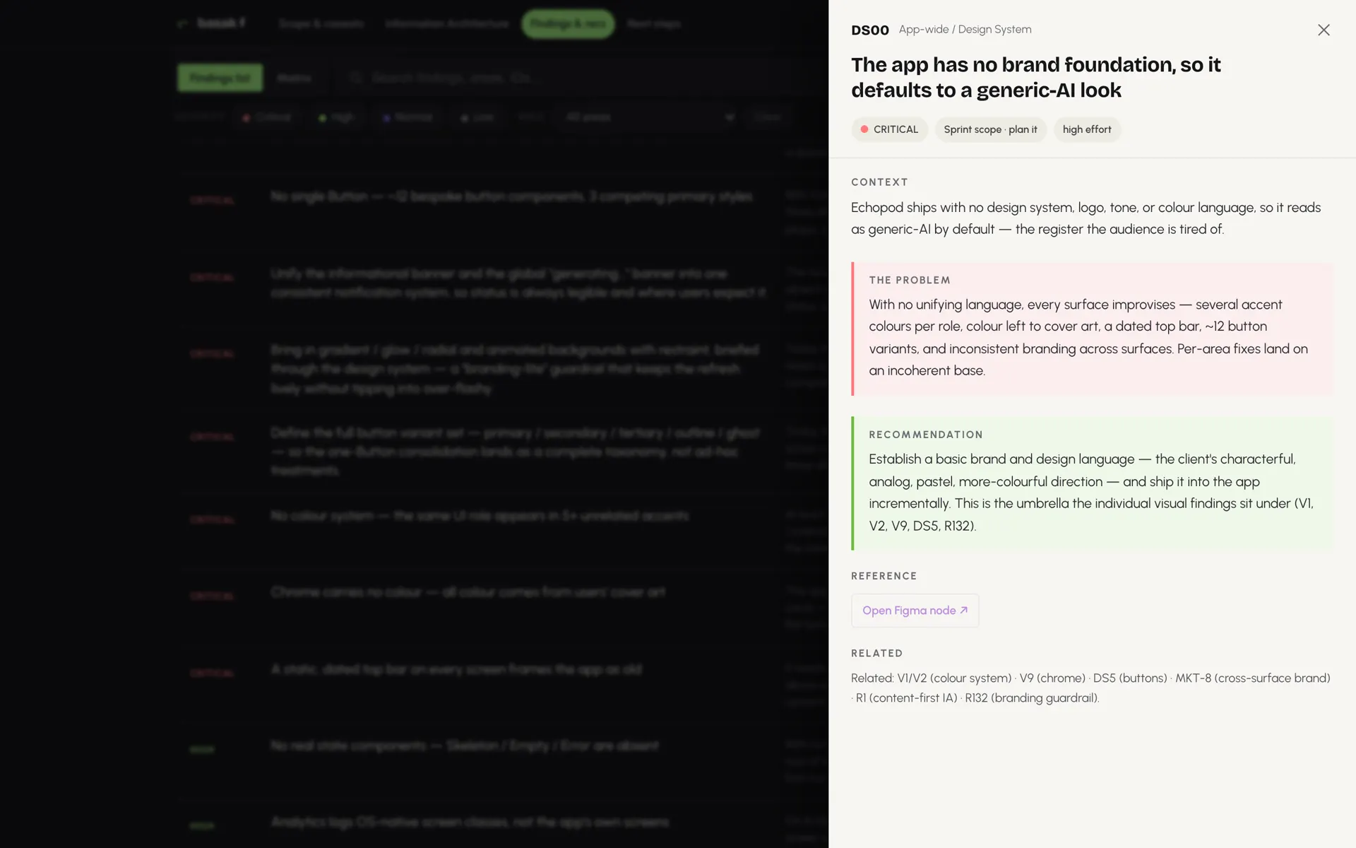
- One format per finding. Context, problem, recommendation, evidence and a link to the Figma node, so each one is a decision path, not an opinion.
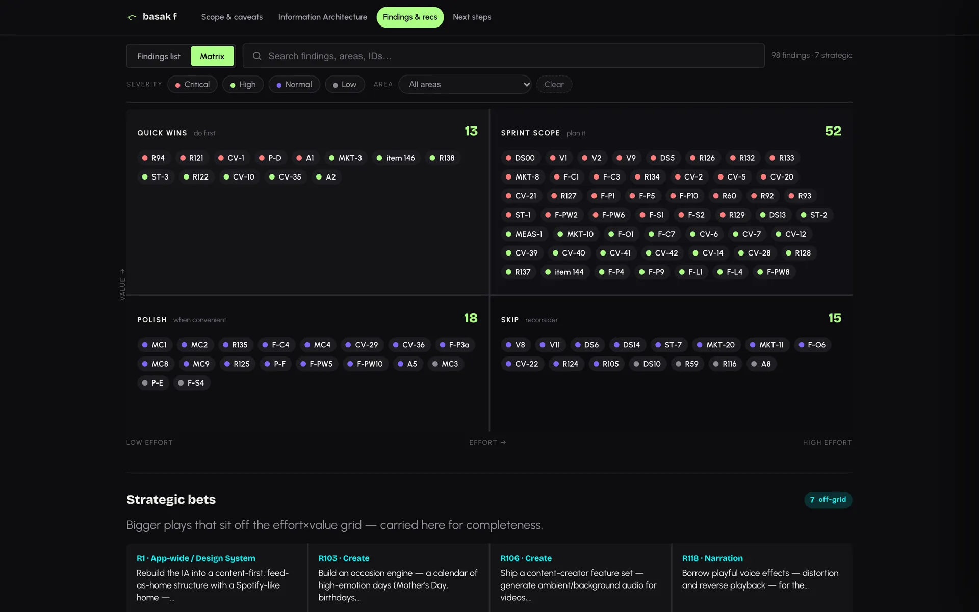
- Graded and plotted. Each item has a severity (critical, high, normal, low) and an effort estimate, which places it on a value and effort matrix: quick wins, sprint scope, polish, or skip.
- Caveats before findings. The report says up front what it doesn't claim: recommendations are directional, not build-ready specs, legal questions belong to the client's lawyers, and it is a snapshot in time.
The audit in numbers
prioritised items: 98 findings and 7 strategic bets
user flows mapped, in four tiers
product areas, each with one improvement theme
hand-picked items to start with
What did the audit find?
A few of the findings, area by area:
- Design system. The same UI role appeared in several unrelated accent colours, and all colour came from users' cover art. The fix: one colour system, one button set, and real loading, empty and error states.
- Onboarding. "Step 1 / 2" had no clear total and "Generating…" set no time frame. We recommended visible progress, honest waits and a value showcase before the paywall.
- Create. Every create made two near-identical episodes, explained nowhere before purchase, which also made the weekly quota misleading.
- Narration. The consent step named only an uploaded voice, not a recorded one, and deleting a voice was unclear and unrecoverable.
- Paywall. No in-app way to cancel, discount maths instead of value, and the selected plan was hard to see.
- Website and store. Three palettes across app, website and store, and website text that failed WCAG AA contrast.
Where AI helped
- One source of truth, built by Claude Code. All 105 items live in a single markdown file. A Claude Code pipeline builds the whole interactive report from it, with count guards so no finding silently drops between the source and the report.
- The plan rebuilds itself. Remove or regrade a finding in the source, rebuild, and the matrix and the Now, Next, Later plan re-sequence on their own.
- Figma at every step. Each finding links to its node in the app's Figma file and in a separate audit Figma file, where the full IA map and flow inventory live.
- Anonymised with checks. For this portfolio version, scripts rewrote every client detail and a leak scan blocks any client-identifying string from the build.
The judgement in every finding is our designer's. The packaging is the system's. See how this works on every project: how we design with AI.
What came out of it
- One encrypted HTML file. Not a PDF, not a deck. The client opens it with a passcode, it works offline, and nothing is hosted.
- An improvement theme for each of the nine areas, so the team sees what each area's findings add up to before reading the detail.
- A searchable findings list and a matrix, filterable by severity and area.
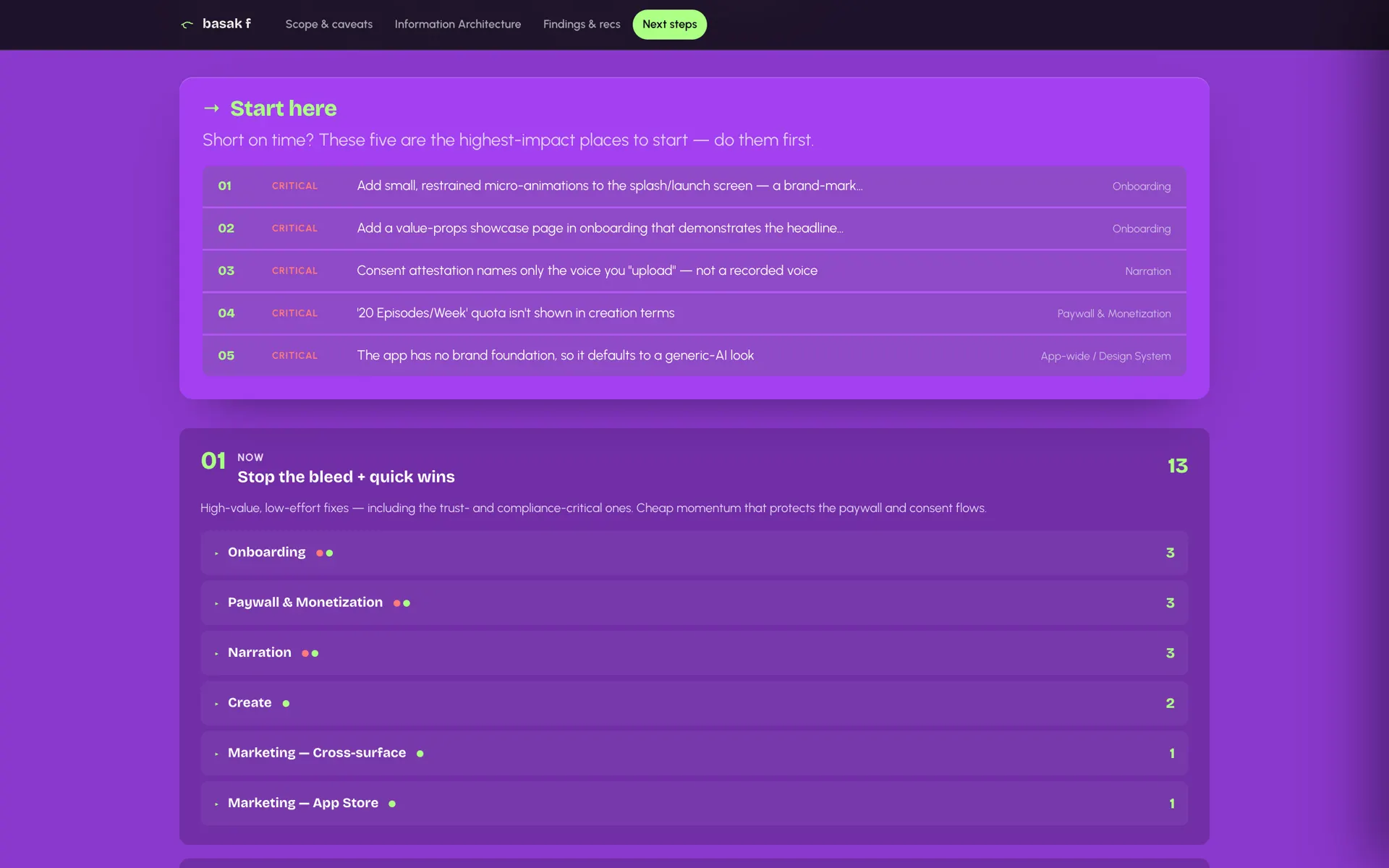
- A sequence, not a backlog. "Start here" names the five highest-impact items. Then Now (0 to 30 days: quick wins and trust fixes), Next (30 to 90 days: the priority sprint) and Later (90 days on: strategic bets).
- A video walkthrough of the full report: watch it on YouTube.
An audit that ends at findings is a complaint. This one ends in a plan the team can take straight into a sprint. Want one for your app? See our UX audit service.
FAQs
Is Echopod a real app?
No. Echopod is a fictional name for a real client audit, anonymised end to end. The structure and method are the real ones; names, numbers and product details are invented.
What do you need from us for a UX/UI audit?
Access to the live app and its Figma file. Support inbox themes, analytics and your main competitors make the findings sharper.
Does AI write the findings?
No. Our designer reviews the product and decides every finding and its priority. Claude Code builds and checks the report around those decisions.



Send us your messiest brief.
Senior design, sped up by AI, decided by people.